The Green Scene
Recent Best In Show winner at RHS Chelsea and steadfastly ranked as one of Britain’s best landscape designers, Andy Sturgeon talks creativity and the evolution of garden design
What drew you to the profession in the first place?
I left school planning to join the army, but soon decided it wasn’t for me. I had no other ideas – the careers advisors at school hadn’t been very helpful in that department – and so I fell into landscape gardening.
It was hard physical work outdoors and it meant working as part of a team so ironically there were similarities with the army. The difference here was that this was creative work. It was making something which I could stand back and look at at the end of each day, and I found it really rewarding.
I always had a love of nature and the countryside, but was far more interested in animals than plants. The plant thing crept up on me and I know it is a passion that I will take to the grave.
How have tastes and attitudes changed in landscaping during your time?
My first garden design was for my brother’s landscape business in the early 80s, before I had even left school. For that, we used York stone or concrete imitation Yorkstone, bricks and recycled railway sleepers soaked in tar, and shrubs rather than perennials. At that time, everything was patios, ponds and pergolas – the three P’s – rooted in tradition. Millstone water features with bubble fountains were de rigeur. All anyone wanted was a poor recreation of an Arts and Crafts style garden like their parents had and no-one wanted anything new.
But since then people have discovered design – Habitat started it and Ikea has played its part: now everyone is design savvy.
[The garden] has climbed from the bottom of the list of must haves to the top, sitting now along with kitchens and bathrooms. In the late 90’s TV and magazines made gardening cool. Since then there have been innovations in building products coupled with a modernist aesthetic – garden design finally moved on. I reckon we are about 15 or 16 years into modern garden design.
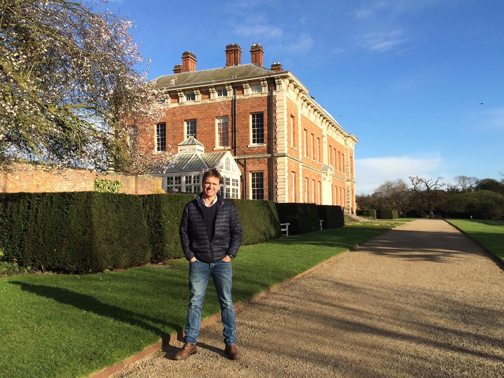
Photo: Andy Sturgeon outside Beningbrough Hall, the grounds of which are a recent commission for the studio | Credit: Joanne Parker, National Trust.
With this perspective, what do you foresee for the future?
New materials will always play a role in ringing the changes but after a flurry of stainless steel, plastic and glass 15 years ago, all the best contemporary gardens I see nowadays rely on natural traditional materials like stone and timber as well as concrete. Sustainability and recycling will inevitably contribute to design in a positive way but I wouldn’t like to predict how.
You have travelled the world for your work, with projects such as the Millennium Seed Bank hunting for seeds in Kenya. How has this shaped what you do?
Good design is mostly about observation so travel has shaped me and my career enormously. Seeing different natural plant communities, architectural styles and cultural idiosyncrasies are hugely important but so too is meeting different people and understanding what makes them tick. Psychology and understanding the client plays a big role in garden design
What other outside stimuli influence the designs you create?
I’m a design junky so I’m interested in furniture, set design, art, architecture, window dressing and underpinning it all the natural landscape. I didn’t study garden design and as each year goes on I become increasingly interested in garden history as there is so much to learn from it.
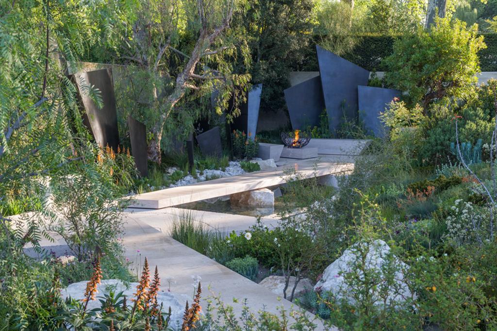
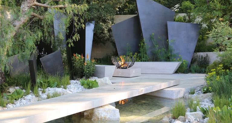
Best In Show-winning garden at RHS Chelsea Flower Show 2016 Photo: RHS
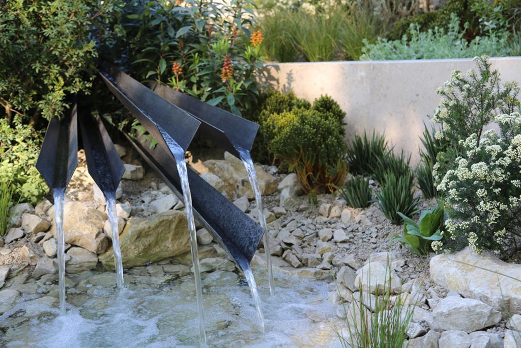
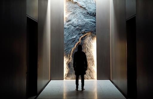
Best In Show-winning garden at RHS Chelsea Flower Show 2016 Photo: Andy Sturgeon Design
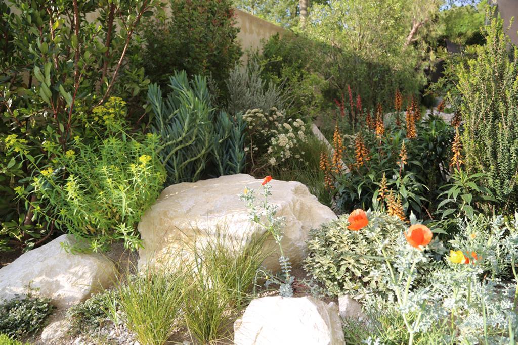
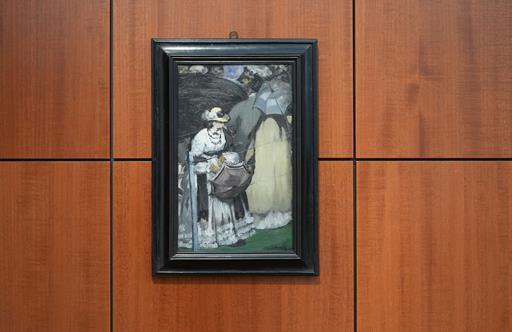
Best In Show-winning garden at RHS Chelsea Flower Show 2016 Photo: Andy Sturgeon Design
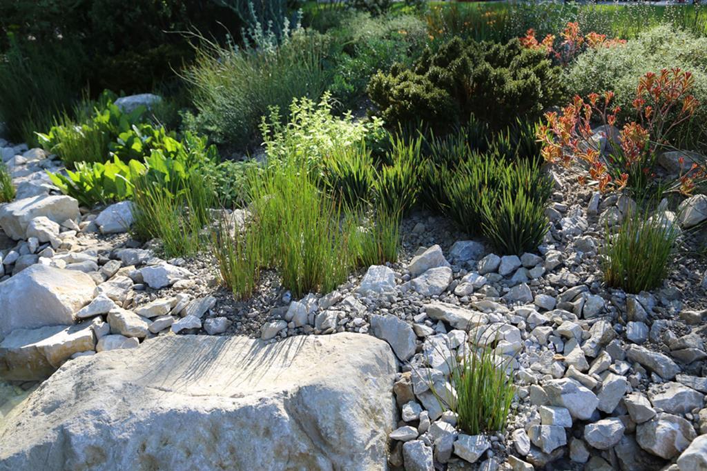
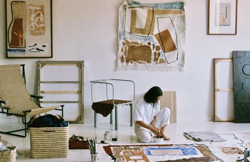
Best In Show-winning garden at RHS Chelsea Flower Show 2016 Photo: Andy Sturgeon Design
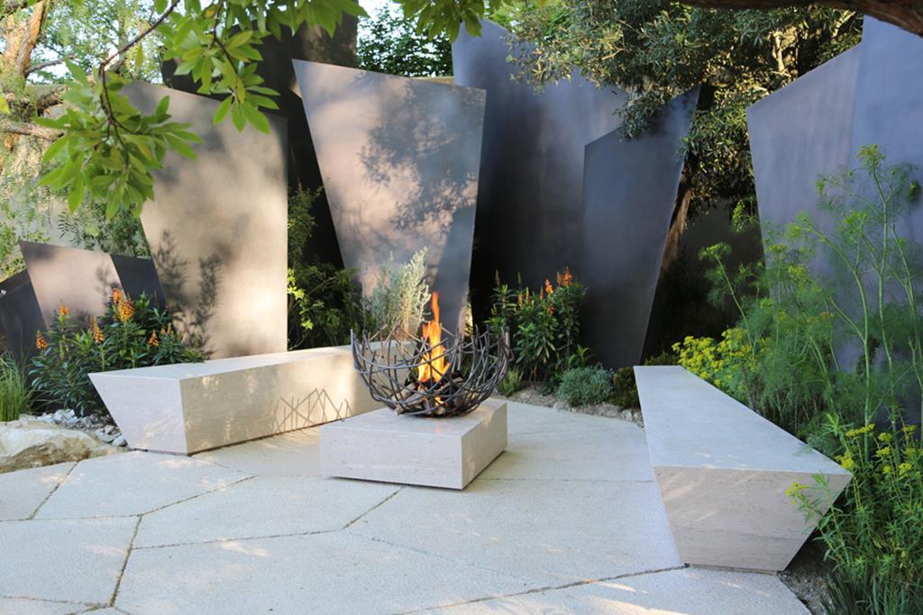
Best In Show-winning garden at RHS Chelsea Flower Show 2016 Photo: Andy Sturgeon Design
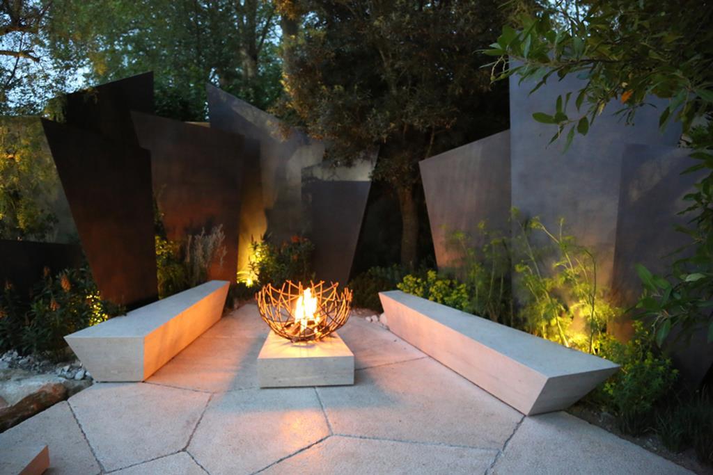
Best In Show-winning garden at RHS Chelsea Flower Show 2016 Photo: Andy Sturgeon Design
What inspired your recent award-winning garden for the Daily Telegraph at RHS Chelsea 2016?
I started out with the shape of the sculptural fins which literally came from the bony plates along the spine of a stegosaurus. It is something plucked out of the deep recesses of my childhood memories. The landscape character of the garden came from a collection of mostly Mediterranean travel in recent years and the observation of natural plant communities, often the plants literally growing by the side of the road.
What creative liberties can you take with a project that has historic sensitivities, such as your recent commission for the gardens at Beningbrough Hall?
We are very lucky at Beningbrough because it is not a historical restoration. Although the property is 300 years old there is little evidence, either documentary or physically of an earlier garden so it has given us great design freedom. That said, we obviously have to respect the setting first and foremost and also the feelings of the visitors who have huge emotional attachment to the existing gardens and of course the National Trust who have been enormously visionary and supportive. The designs, although contemporary, draw heavily on the past and and reference the history of the property.
Which project from your past are you most fond of?
I am particularly fond of some of my Chelsea gardens, particularly 2005, 2010 and 2016. All had what I consider the perfect balance of hard landscaping and innovative planting schemes and all were very successful with the way they arranged the space and consequently all felt much larger than the other plots. The garden in 2005 also had a water feature with black holes in the water surface –people still ask me how it was done.
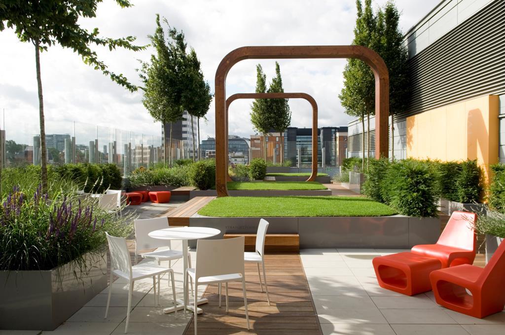
Photo: Andy Sturgeon Design | The rooftop garden at Great Ormond Street Hospital, London
The Chelsea show gardens are always rewarding because they are complete and finished, which real gardens never are. Of my ‘real’ projects, our Great Ormond Street Roof Garden stands out. It was on a relatively low budget, a fairly unpromising roof top and a feat of engineering to get everything up there. But, the resulting design is simple and sculptural and most importantly enjoyed regularly by all the hospital staff.
Visit andysturgeon.com
