Haute Design: Boodles’ Pas de Deux
We talk to Rebecca Hawkins, Head of Design at Boodles, for her view on Boodles latest haute joaillerie collection - Pas de Deux - plus comment from Elisabeth Moch, the talented illustrator who captured the collection for our pages
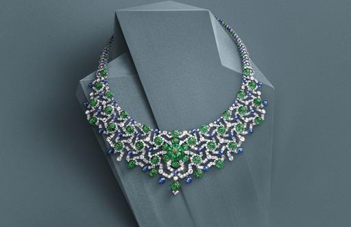
Created in collaboration with the Royal Ballet, the British brand’s latest high jewellery collection, Pas de Deux, is an homage to the most elegant of the performing arts and to the values it shares with the jewellery world: talent, dedication and a passion for perfection.
How does designing a haute joaillerie collection differ from the other pieces you create? Does it provide any unique challenges and freedoms?
Creating a haute joaillerie collection is very different as the individual designs need to be expressive and unique but also clearly part of a related series that collectively tell a story. There is more artistic freedom. It is possible to use one off gems and to spend months sourcing and cutting unique shapes, as well as using more complex and intricate techniques as no two pieces are the same or will ever be made again. In a collection of this nature more of the designs are for statement pieces, so this provides, in a sense, a larger canvas to layer ideas and motifs.
Beyond capturing the beauty of the stones and providing a showcase for your incredible handiwork, what else were you trying to communicate with this new collection?
I wanted this collection to express in an abstract form both the physical and emotional attributes that make ballet, and in particular The Royal Ballet, so special. Especially to capture the relationship between two dancers.
Of all the pieces in the Pas de Deux collection, do you have a personal favourite?
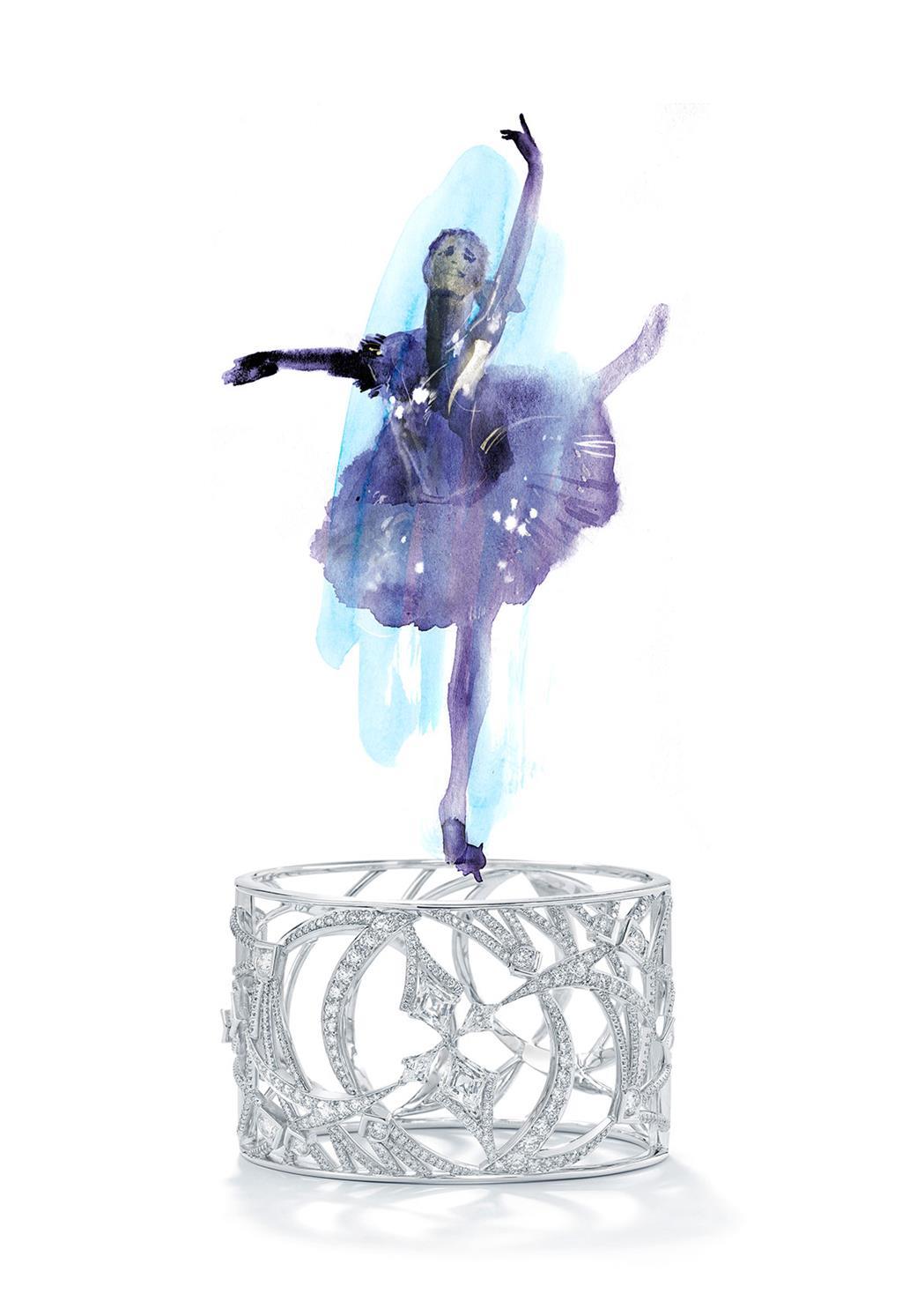
My personal favourite is the platinum cuff with four kite shaped diamonds in the centre. I was fortunate enough to see the dress rehearsal for The Royal Ballet’s “Connectome” and I was totally mesmerised by the performance. The sketches and notes I made at the time eventually grew into this design. Through the use of the four kite cut diamonds I wanted to represent the dancer as a dynamic force surrounded by a constellation of illuminated lines and angles.
Comment from the illustrator –
This bracelet with its lines and shapes looks like an illustration of the moves and swings of a ballet dancer. I immediately thought of adding a tiny dancer on top of it, to make it look like the vintage music boxes I loved as a child.
Elisabeth Moch, IllustratorTo view pieces from the Pas de Deux collection, click here
