Haute Design: Tiffany & Co.’s Blue Book
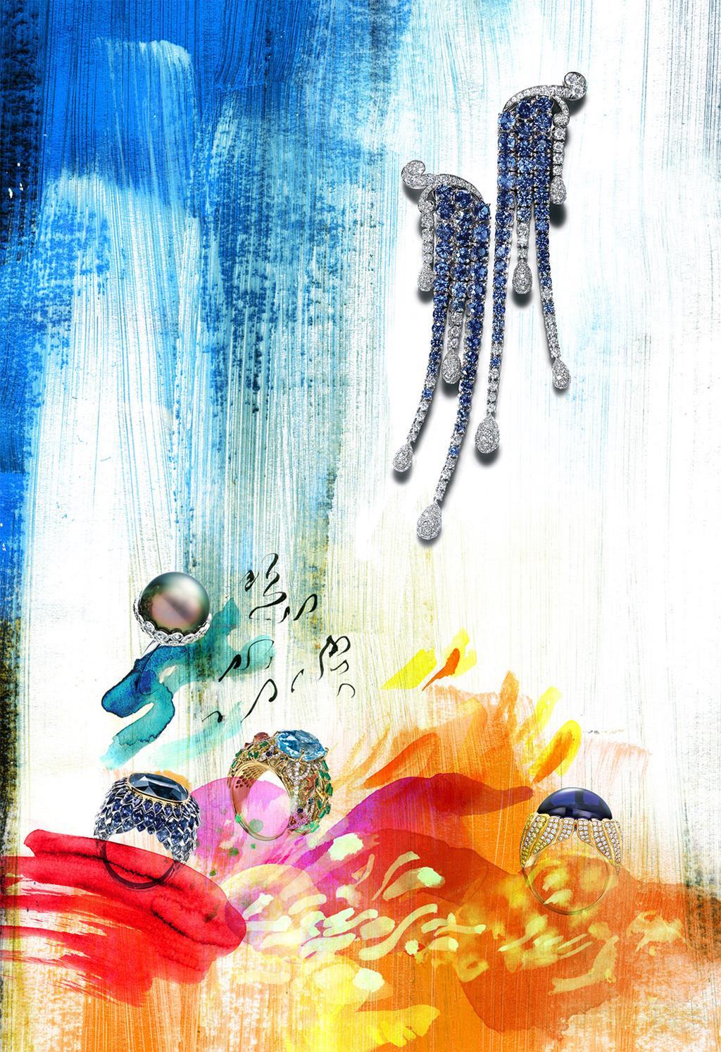
We talk to Francesca Amfitheatrof, Design Director at Tiffany & Co., for her view on Tiffany’s latest Blue Book haute joaillerie collection - plus comment from Elisabeth Moch, the talented illustrator who captured the collection for our pages
This year’s Blue Book high jewellery collection, entitled Art of the Sea, was inspired by nature's most changeable element – water.
How does designing a haute joaillerie collection differ from the other pieces you create? Does it provide any unique challenges and freedoms?
Blue Book is one of the greatest symbols of Tiffany & Co. Its rich heritage draws the finest artisans, who create a world of glamour and luxury that no other jeweller can equal.
To design this collection with these talented people and the most extraordinary gems on earth was an honour and a privilege – it gives me great pleasure to create beautiful designs with these wonders of the natural world.
Beyond capturing the beauty of the stones and providing a showcase for your incredible handiwork, what else were you trying to communicate with this new collection?
Blue Book 2015 explores the power of the sea, honouring it as the source of life and acknowledging the many ways in which we are inexorably linked to the natural world.
Just as water responds to wind, the jewellery responds to every movement, bringing us closer to this ultimate source of life and beauty.
There is great beauty in the flora found deep below the surface of the sea. This secret world inspired me to design colourful gardens blooming with brilliant gemstones. I wanted people to experience the mystery and stillness of diving into this silent but very beautiful world that is hidden from us.
Of all the pieces in the Art of the Sea collection, do you have a personal favourite?
I wanted to design settings for pearls – treasures that emerge from the sea to become icons of style and luxury – that highlight their subtle colour and iridescence but that would also make them fun. These pieces are swingy, lively and on the move.
Comment from the illustrator –
I really loved the playfulness and bright colours of "Under the Sea", as it reminded me of my diving experience at the Great Barrier Reef in Australia. It was fun to travel back to this place when researching reference images and daydreaming of the surreal moments under water –the light and sounds.
Elisabeth Moch, Illustrator
